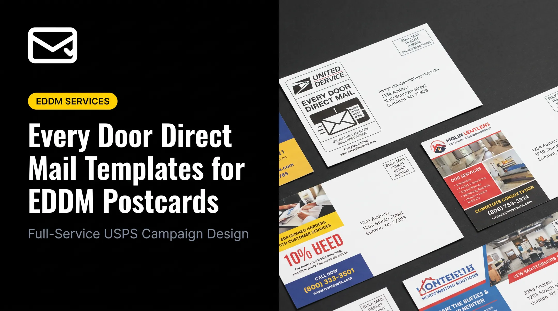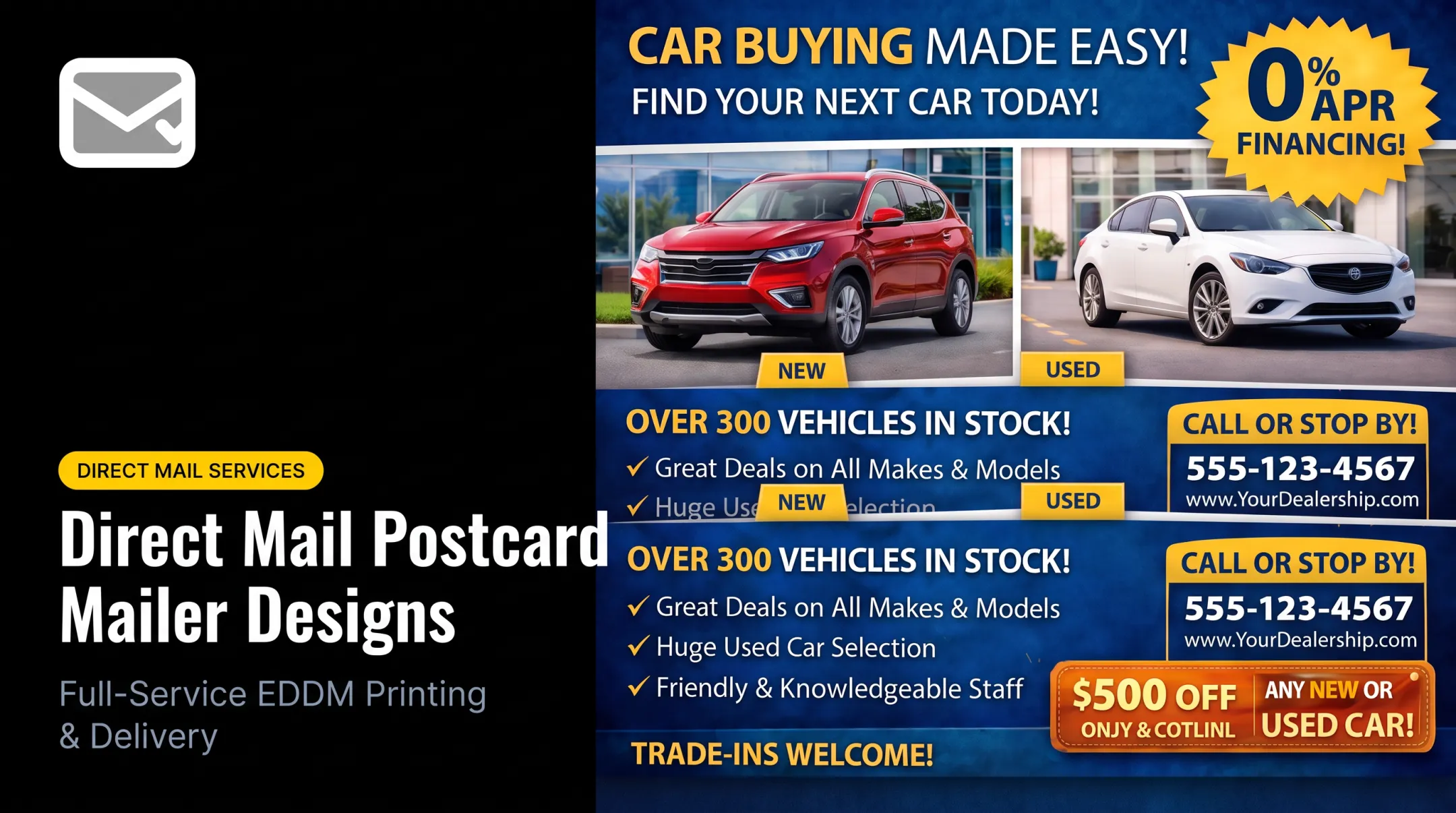

Small businesses run into the same snags every time. Which layout fits the offer? How do you squeeze a clear call to action into a few square inches without cluttering the design? What does USPS actually require for address placement and postage? And how do you get artwork print-ready without a design team on staff?
There's real upside for getting this right. Direct mail sent to house lists delivers a 161% ROI, according to the ANA's 2023 Response Rate Report, outperforming email, paid search, and social advertising by a wide margin.
This guide walks through reusable layout principles, industry-specific template ideas, a USPS-readiness checklist, and the design-to-mailbox workflow.
Key Takeaways
- Build every postcard around one message, one offer, and one obvious next step.
- Treat the promotional side and the mailing side as separate zones with separate jobs.
- Start from a print-ready template and confirm current USPS specifications before print.
- Choose EDDM for neighborhood-wide reach without a list, or a targeted list for specific geographic or demographic filters.
How to Build an Effective Postcard Layout
Before opening a template file, define the job the postcard needs to do. A lead-generation mailer, a limited-time sale, a new-location announcement, a "just listed" update, or a reactivation offer to lapsed customers all need different structures, even if the trim size is identical.
Two Sides, Two Jobs
- Promotional side carries the headline, primary image, brief value proposition, offer, and CTA—readable at a glance.
- Mailing side holds the recipient address, postage or indicia, return address (where required), personalization, and response instructions.
Visual hierarchy does the heavy lifting. One dominant headline, a focal image, and generous spacing beat five competing elements fighting for attention. If a reader has to hunt for the point, the postcard has already failed.
Choosing Size and Orientation
Size depends on how much content you're carrying, image needs, and budget. Common postcard sizes map to typical campaign jobs:
| Campaign | Size | Typical Use |
|---|---|---|
| Contractor special | 4 x 6 | Service and seasonal promotions |
| Insurance quote | 4 x 6 | Quote follow-ups |
| Restaurant menu | 5 x 7 | Menus and daily specials |
| Fitness studio | 5 x 7 | Membership offers |
| Real estate | 6 x 9 | Agent announcements, new listings |
| Home services | 6 x 9 | Landscaping, HVAC, plumbing |
| Event announcement | 6 x 11 | Grand openings, sales events |
Note the tradeoff: USPS First-Class postcard prices apply only within set size limits: 3-1/2 x 5 up to 4-1/4 x 6 inches for retail postcards, and up to 6 x 9 inches for commercial (presorted) postcards. A 4 x 6 card fits both; 5 x 7 and 6 x 9 can still qualify for commercial postcard prices; 6 x 11 exceeds the postcard maximum and is priced as a letter-size piece in a different class. Confirm treatment with your printer or mail provider before you lock the size.

A Quick Wireframe Example
Picture a roofing postcard built in clear zones:
- Top third: headline ("Storm Damage? Free Inspection in 48 Hours") over a crew-on-roof photo
- Middle: three-line benefit statement plus the service area
- Bottom: phone number, QR code, and small-print redemption terms
- Flip side: address block, postage zone, and a short reinforcing line near the top
Template checklist before you finalize the file:
- Logo placement consistent with brand guidelines
- Safe margins and bleed built into the file
- Images at print resolution (minimum 300 DPI)
- Consistent color across front and back
- Type large enough to read at arm's length
- Clear space reserved for postal processing
Design the Message, Offer, and Call to Action
Short copy works better than clever copy. Follow this sequence:
- Name the audience or problem
- State the specific benefit
- Add proof or a differentiator
- Present the offer
- Close with the next step
Keep it scannable:
- Short headline (under 8 words when possible)
- One or two lines of supporting copy
- Bullets or callouts instead of paragraphs
- Plain language over industry jargon
Building an Offer That Actually Converts
Run every offer through four checks:
- Relevant: Does it match what this audience actually wants?
- Easy to understand: Can someone grasp it in three seconds?
- Motivating: Is the value clear enough to prompt action?
- Time-bound: Is there a deadline or condition that creates urgency?
Matching CTAs to Campaign Goals
Pick the CTA that fits the objective, not the one that sounds the most polished:
- Call for a free estimate or quote
- Book an appointment online
- Visit the store or office
- Scan a QR code to a landing page
- Present a printed promo code at checkout
Once the CTA is set, make sure it stays readable. Color and contrast matter more than most people assume. Text placed over busy photographs often becomes unreadable at a glance.
As a benchmark, WCAG 2.2 recommends a minimum 4.5:1 contrast ratio for standard text and 3:1 for large headline type. That ratio is a useful gut check even though it is a web standard, not a USPS rule.
Personalization helps when it is accurate. A recipient's name, a neighborhood reference, or a homeowner-specific line can lift response. Double-check every merge field before printing: a wrong name looks worse than no personalization at all.
Before you print, test every response path:
- Phone number
- QR code
- Landing page
- Promo code
Postcard Template Ideas for Common Small-Business Campaigns
Different verticals need different structures, even when the underlying formula (headline, benefit, offer, CTA) stays the same.
Real estate
"Just listed," "just sold," and market-update formats work best with a recognizable local identity. A 6 x 9 real estate postcard might pair a suburban home photo with a "Thinking of Buying or Selling Your Home?" headline and a free home-valuation CTA.
Insurance
Quote-renewal and free-quote formats keep the offer simple and the contact path obvious. A 4 x 6 insurance postcard can lead with "Request a Free Quote Today" and put the phone number front and center.
Roofing and home services
Lead with the problem (storm damage, seasonal maintenance, or an overdue inspection), then the benefit, a trust element, and a booking CTA. A 6 x 9 home services postcard for landscaping, HVAC, or plumbing can follow that structure and end on a local-expert contact point.
Dental, medical, and wellness
A welcoming photo, one specific service, and a low-friction booking route beat a full list of procedures. Skip unsupported outcome claims. Health-related advertising needs substantiation, and FTC guidance treats vague promises as a compliance risk.
Retail, restaurant, and new-location openings
Grand-opening and limited-time-offer formats need a trackable redemption mechanism. A 6 x 11 event announcement fits well: for example, a coffee shop launch could pair a "Now Open" headline with a $1-off-drink offer and free samples.
Political campaigns
Keep the piece to the candidate or issue, district relevance, a few supporting points, and the election deadline. Federal candidate mailings need specific disclaimer language and formatting under FEC rules. Verify current requirements before printing; state and local rules can add further obligations.

USPS Mailing Format and Print-Readiness Checklist
Postal specifications shift based on mailpiece type, size, and mailing method, so always confirm current USPS standards before finalizing a template.
Address and Postage Zones
- Keep the delivery address in its required position with adequate clearance from other design elements.
- Avoid graphics or text near machine-readable zones — printing in that space can interfere with automated processing.
- Confirm postage placement, indicia treatment, and permit requirements with your printer or mail provider.
Production Terms Worth Knowing
- Trim size and bleed: artwork needs to extend past the cut line so nothing white shows at the edge.
- Safe area: keep text and logos clear of the trim to avoid accidental cropping.
- Resolution: images should be at least 300 DPI at final size.
- File format: PDF is the most reliable for print; JPG and PNG work if resolution holds up.
- File size: high-resolution photography can produce large files, so check your upload portal's file-size limit before you submit.
Preflight Review Before You Print
Run through this list before approving the proof:
- Spelling, dates, and offer terms
- Contact information and address data
- Personalization fields (spot-check a sample batch)
- Image quality at full size
- QR code functionality
- Alignment between the design file and the mailing list
Separate creative approval from mailing approval. Confirm the message and brand look right first, then confirm the piece meets postal and production specs.
Current USPS guidance always takes precedence over generic checklist examples.
From Postcard Template to Mailed Campaign
A postcard template only earns its keep once it turns into a mailed, tracked campaign. The workflow runs:
- Define the goal and audience.
- Choose EDDM or a targeted mailing list.
- Select or build the template.
- Approve the proof.
- Print, process, and mail.
- Monitor responses against the objective.
Pick the reach method that matches your goal:
- EDDM: Covers every address on selected routes when you don't have (or need) a list; 200-piece minimum
- Targeted lists: Filter by geography, demographics, homeowner status, or industry
This is where DirectMailEasy fits for small businesses that don't want to manage the moving parts themselves. The company handles design or artwork refinement, commercial printing, addressing and barcoding, USPS paperwork, and delivery to postal facilities. Most orders ship within 5-7 business days after proof approval, and rush options are available for time-sensitive campaigns.
Track responses against your original goal with tools such as:
- A dedicated phone number
- A landing page or QR code
- A promo code
Once a template performs, keep the brand elements and layout structure fixed. Swap only the audience, offer, and imagery for the next drop.

Frequently Asked Questions
What does a postcard layout look like?
A postcard layout has two sides: the promotional side (headline, image, offer, CTA) and the mailing side (address block, postage area, and space reserved for postal processing).
What is the correct format for mailing a postcard?
Follow current USPS standards for your postcard size and mail class. Confirm address placement, postage, dimensions, margins, and automation rules before you print.
What should go on the front and back of a postcard?
The front usually carries the main visual message and offer. The back supports delivery details, contact information, and any redemption instructions.
How much text should a postcard have?
Keep it brief and scannable: one audience, one benefit, one offer, and one CTA. Skip the full list of services; save that for your website.
What size postcard is best for direct mail?
Size should match your content, visual goals, and budget. Formats like 4 x 6 keep costs low, while 6 x 9 or 6 x 11 give more room for imagery. Confirm postage class either way.
How do I make a postcard ready for USPS mailing?
Use print-ready artwork with correct bleed and safe areas, then confirm address and postage zones. Verify data accuracy, approve a proof, test QR codes, and run a final compliance check with your printer.